The Psychology of the Pause: Why Friction Builds Trust in a High-Stakes World

We are all conditioned to equate “frictionless” with “good”. Tap to pay. One-click checkout. Auto-fill everything.
Yet there are moments where slowing the experience a little makes it feel safer, more considered and more valuable. This is positive friction - a small, intentional pause that protects people, boosts confidence and reduces costly mistakes.
In this article we unpack what positive friction is, when it helps, when it hurts, and how to design it with care. There are no dark patterns here. Just clear, humane moments that make customers feel in control.
What we mean by positive friction
Positive friction is a deliberate, benefit-led interruption that improves the outcome. It is the extra confirmation before sending money. The review step that catches a date error before you book flights. The second look at your dosage before a prescription is renewed.
Two ideas from psychology explain why it works:
The key is intent. If the pause helps people make a better decision or avoid harm, they will usually welcome it. If it exists only to serve the business, they will feel it immediately.
When going slower makes the experience better
Money decisions need time to breathe
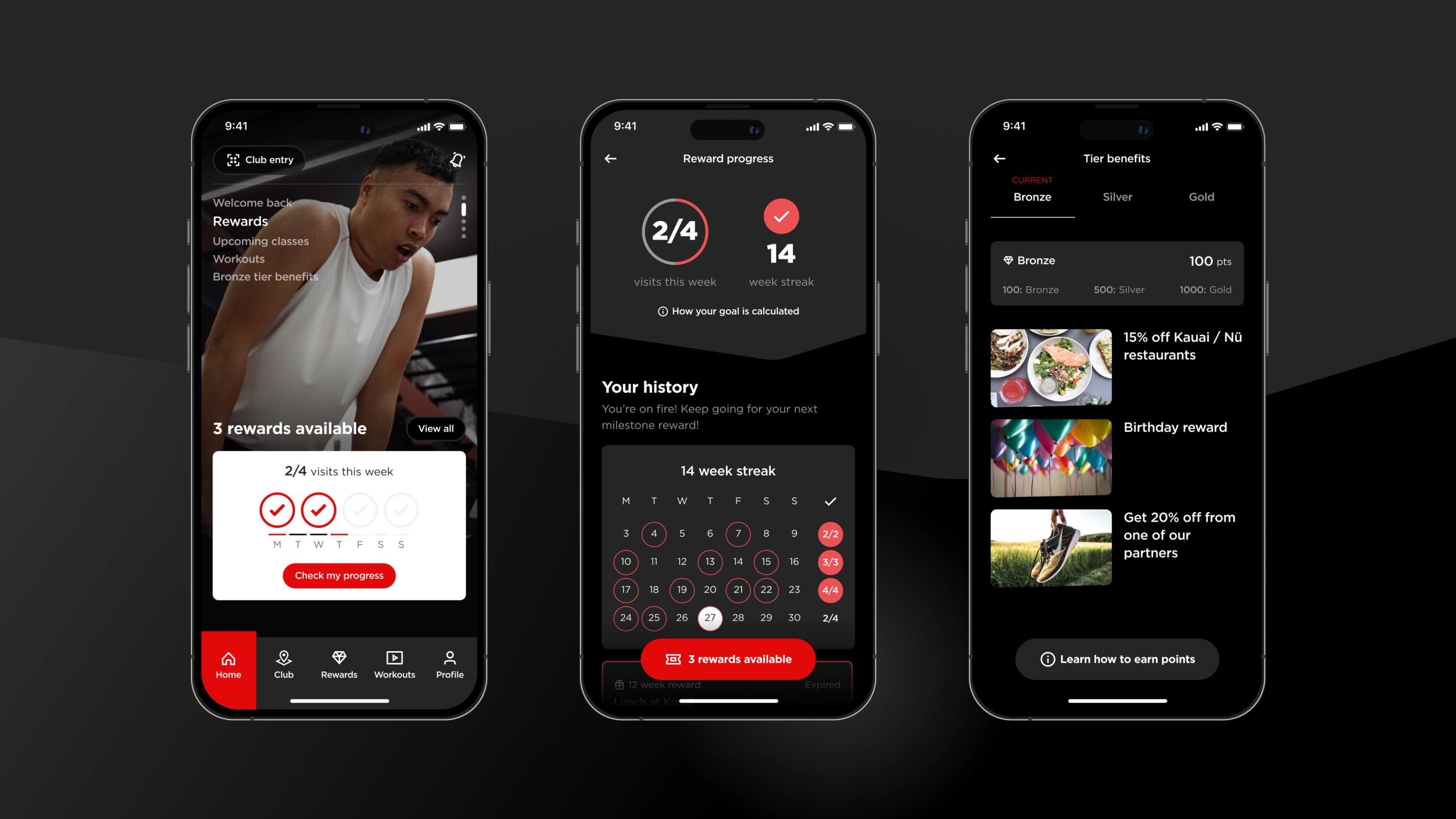
Payments, loans, insurance and investments are inherently high stakes. Customers expect reassurance. A short review screen that surfaces the essentials - the amount, the counterparty, the fee and the time to settle - reduces anxiety and errors. Two-factor verification can feel like a help, not a hindrance, when you explain what is happening and why. The result is fewer disputes, fewer support contacts and a calmer moment of commitment.
Travel rewards honesty and clarity
Travel purchases combine deadlines, complex rules and expensive consequences. Positive friction here is simple: show your working and invite a pause. Clearly surface baggage, exchange rules and seat choices before purchase.
Offer a one-screen “Are these the right dates and names?” moment. Customers perceive thoroughness and feel treated fairly. Your contact centre will thank you.
Health and wellbeing demand deliberate steps
In healthcare, safety beats speed. A short identity check before showing sensitive records, a moment to confirm dosage changes, or a simple consent recap before sharing data with a new provider are not obstacles - they are safeguards. Each one reduces risk and increases trust in the service.
Premium experiences benefit from a little ceremony
In luxury and high-consideration retail, the journey is part of the value. A slower, more cinematic flow can heighten anticipation and convey quality.
The trick is to keep the pause purposeful. A guided configuration that helps you choose materials and finishes feels like craft. A forced delay to create fake scarcity does not.
Where positive friction backfires
Bad friction is anything that adds effort without helping the user.
Long forms that ask for information you already have. Hidden costs that appear only at the last step. Consent that is difficult to understand.
If customers cannot see the benefit of a pause, they will drop off, complain, or both. The line is simple: explain the pause, show the benefit, and keep it as short as possible.
Design principles for positive friction
1) Write the pause like you would speak it
Plain language beats legalese. Instead of “Your transaction requires additional verification,” try “We are just checking it is really you to keep your money safe.” If the step exists to protect the customer, say so, and say it up front.
2) Show the gain, not just the step
Make the benefit visible. A review screen should not repeat the entire journey - it should highlight the few details people most often get wrong. If a check prevents fraud, state that clearly. If a delay is due to stock checks or rules, show the progress so it does not feel like dead time.
3) Keep decisions reversible where you can
Positive friction works best when people know they have a safety net. If you can, add an “undo” window or an easy path to amend details. Even a short cooling-off period can transform how confident people feel.
4) Make accessibility the default
Friction that relies on tiny text, colour-only cues or complex patterns will trip people up. Treat accessibility as a first-class requirement so that the pause helps every user, not just the most digitally fluent.
5) Use data to tune the friction, not to justify it
If your analytics show high abandonment on a confirmation screen, do not remove it blindly. First check if the copy is confusing, the information is irrelevant, or the step is appearing too early. Positive friction is often a content problem more than a UI problem.
Patterns you can ship this quarter
The single, confident confirmation
End complex flows with a one-page summary. Surface the three or four details that matter most. Use a clear, unmissable button to confirm. If something is irreversible, say so in plain language. This pattern reduces errors at checkout, in travel and in account changes.
Human-centred security checks
Strong verification does not have to feel like an interrogation. Tell people what will happen and why. Offer simple options; app approval, SMS code, email. Keep the step inside the flow rather than bouncing people to another app without context. If something fails, explain the next best action in a sentence, not a paragraph.
Operational transparency
If the system is doing useful work such as checking inventory, validating identity, confirming eligibility, show it briefly.
A short “We are checking this is in stock with our suppliers” message, ideally with progress, turns a wait into reassurance. Use this sparingly and only when the work is real.
Guardrails for risky actions
Any action that moves money, shares health data or deletes accounts deserves a pause. Make the risk explicit, require a short confirmation, and offer a way back if possible. Customers will thank you for the moment to think.
Positive friction for product leaders
If you own a roadmap, here is how to bring positive friction into the way you plan and ship.
A note on “machine UX”
As agentic tools become common, your users are people and their software agents. That means APIs, schemas and events are part of the experience.
If an agent cannot parse your contract or gets inconsistent errors, the human sees a broken journey. Treat these machine surfaces like UI:
These are UX decisions as much as engineering choices because they directly affect speed, reliability and trust. If you want a pragmatic checklist, align the above with the OWASP guidance for LLM applications and you will keep human and agent interactions on the happy path.
Related article: 10 Key Trends in User Experience for 2026
Where we have seen this work
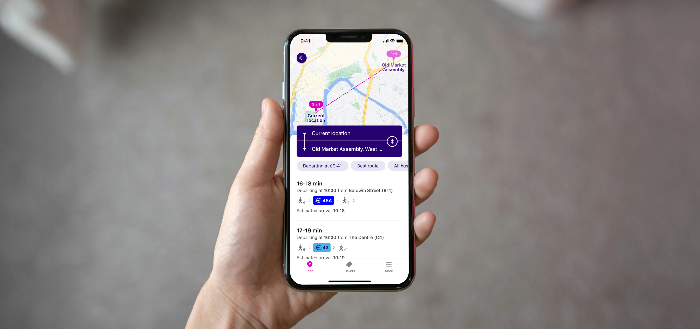
In complex, high-stakes journeys, small safeguards often deliver outsized gains. In transport, for example, clearer review steps and better error prevention reduce drop-offs and service contacts while improving on-time journeys. You can see how we approach this in our work with First Bus, serving 1.6 million daily passengers - read the case study here: Revolutionising the transport app experience.
Start small. Aim for certainty.
Positive friction is not about adding steps. It is about adding certainty. Choose one high-impact moment. Write a clearer pause. Make it accessible. Explain the benefit. Measure the change. Then expand to the next journey.
If you want help identifying where positive friction will increase trust and reduce risk in your product, we would love to collaborate. Explore our capabilities at Future Platforms – Expertise or get in touch directly at Contact us.